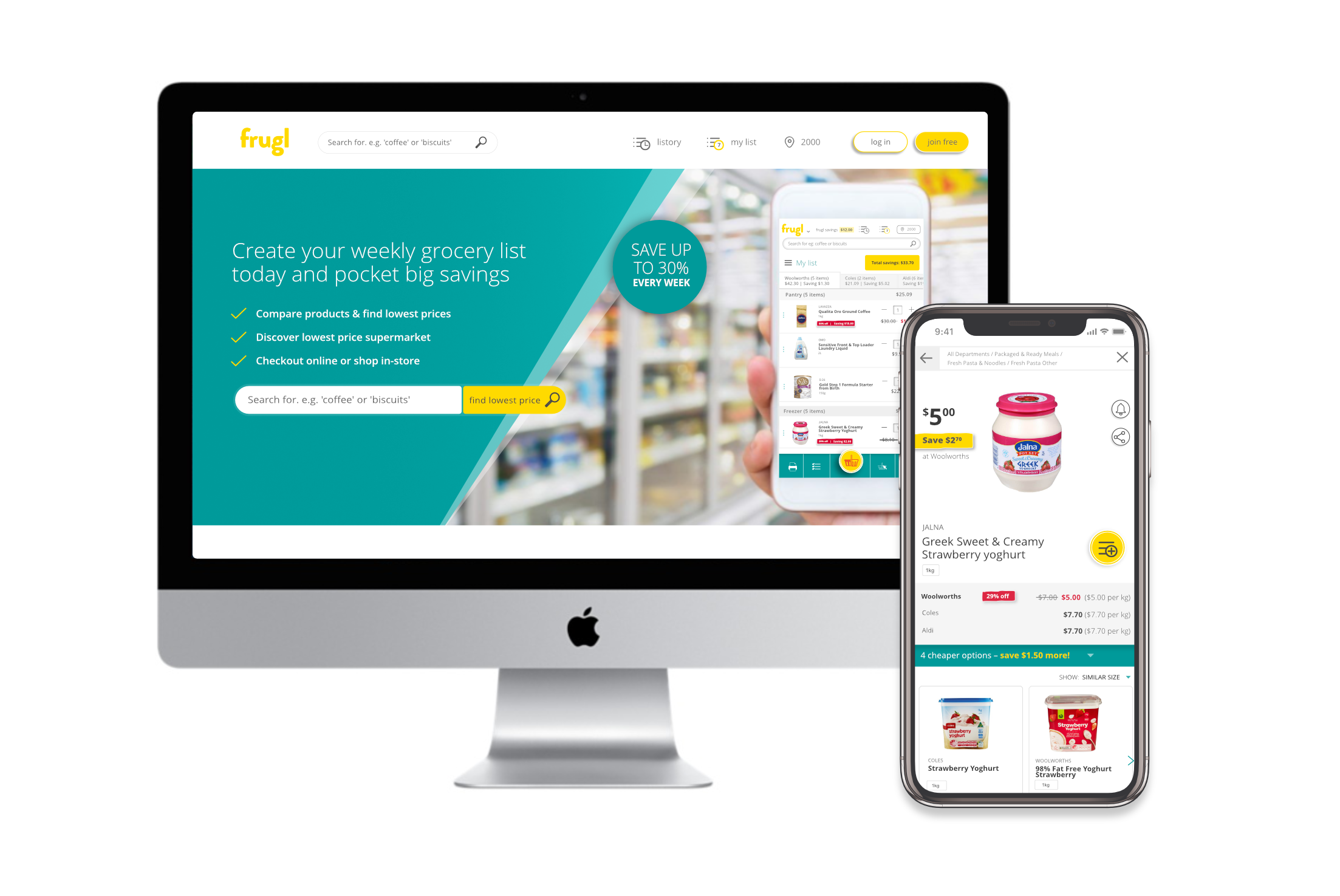
A Perth start-up, frugl enables users to build a shopping list and compare grocery prices between the two main supermarkets here in Australia.
The project
I joined frugl in October 2016, at which point there was a working prototype, and research had been completed in to who our target market was, and what their expectations would be of a grocery comparison site, how they could see themselves using it, etc. We were able to find products, create and compare lists, and send groceries online. However, it wasn't usable on mobile, so this became the main focus over the next few months – how to build a product that will be easy and enjoyable for customers to use on their mobile?
The team
With myself as the UI & UX designer, I worked with the product manager / CMO (we all wore a few hats!), marketing assistant, 2 front-end software developers, and a back-end developer. We also had two data analysts on the team. The dev team were responsible for building the functionality, while I was responsible for the user journey and how whe whole site looked.
 Visit site
Site will open in new tab.
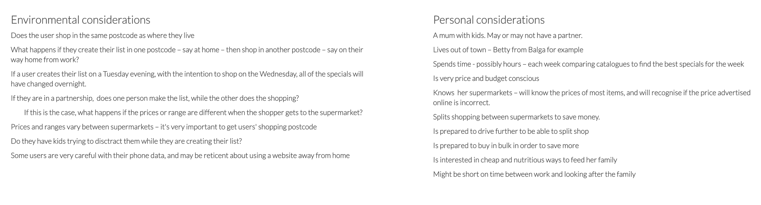
Some considerations to keep in mind when imagining our user interacting with frugl
MVP
Deciding to start fresh, we began by brainstorming ideas around ‘quick wins’, (or ‘tasters’ as we called them) – products which we could quickly bring to market that would also provide value to our customers.
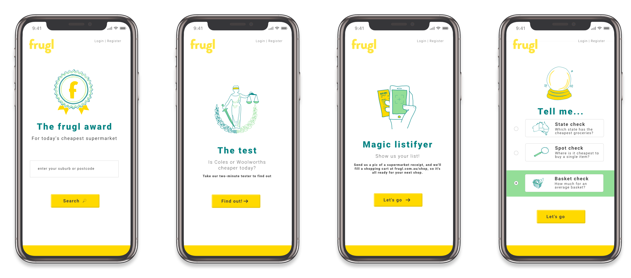
The 'taster' concepts
From these tasters, a ‘spotcheck’ tool was chosen as a starting point. Users would enter their postcode and a product, and we would display results, allowing them to find the best price near them.
This simple tool gave us a starting point to begin testing and gaining feedback.
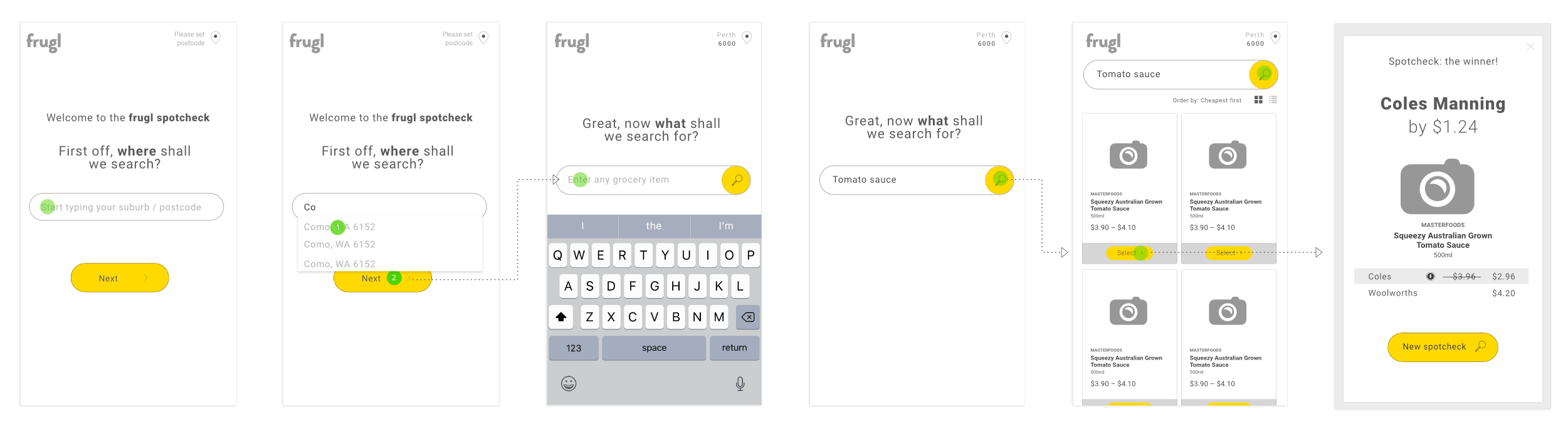
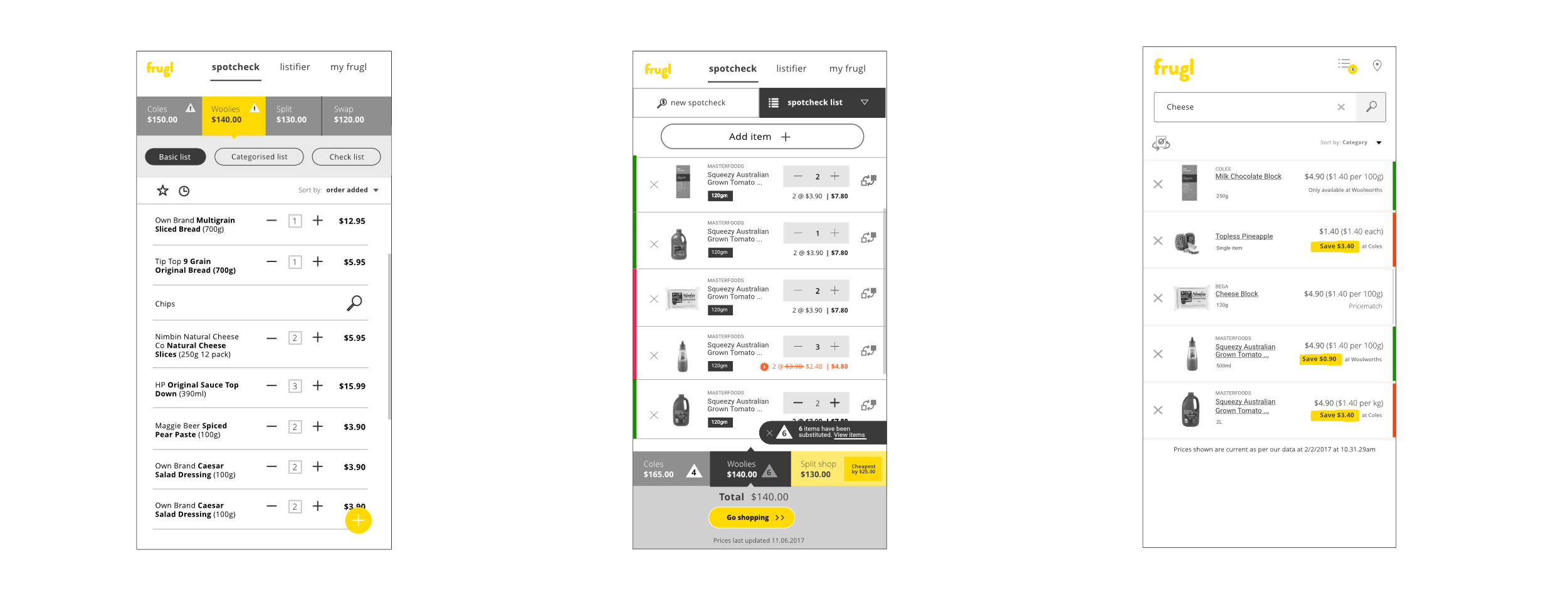
The first user journey for Spotcheck
Lists + improved search
Meanwhile, two workshops were held to work out ‘What next?’ – what will the product be, what features will we include etc.
These sessions were hugely beneficial – great ideas came from members in all departments, and within the two sessions we had nutted out a plan.
Lists
Between each workshop, I wireframed up some of the ideas discussed, to consolidate ideas and facilitate the next round of discussion. During the following weeks I created multiple paper prototypes to quickly test and get feedback on user journeys, as well as getting input from the dev team regarding what was possible on the small timeframes we were working with.
We decided on three lists – ‘My list’, which would be the current shopping list, a ‘Checklist’, and a ‘List history’ which became ‘Listory’.
Initially we had planned to have multiple ‘My lists’, however, it became apparent that multiple lists could be confusing to manage for the user, and difficult to build and manage for the developers.
I proposed instead to use the ‘list history’, to help users manage their items, by building in intelligent sorting, so all items previously purchased could be sorted by ‘weekly’, ‘monthly’ and ‘rarely’ items.
Getting a better idea of how we wanted the list to be – after the second workshop
- Three lists - 'My list', 'My checklist' and 'Listory'
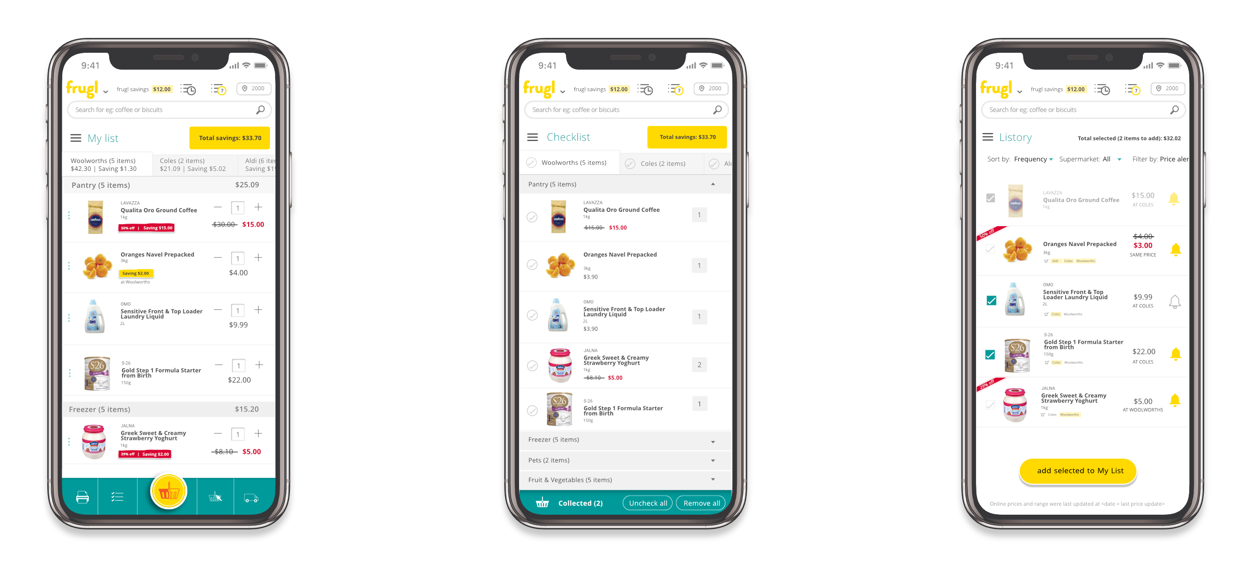
- Users can switch individual items between supermarkets, or switch all. Users are notified if some items that aren't available at both suppliers cannot be switched
- Users can print checklist, or create a mobile checklist to take shopping.
- Users can see total savings made – at this point it only reflects the savings to be made between supermarkets, it doesn't include savings made from specials
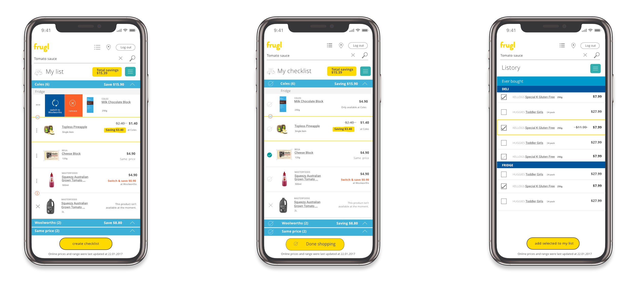
The first set of lists – 'My list', 'My checklist' and 'Listory'
Searching
Of course, users need to be able to find the items that they want to add to their list. The searchbar in the header allows users to search from any screen within the site, while catalogue links in the footer, and catalogue links on the homepage are also entry points to the search journey.
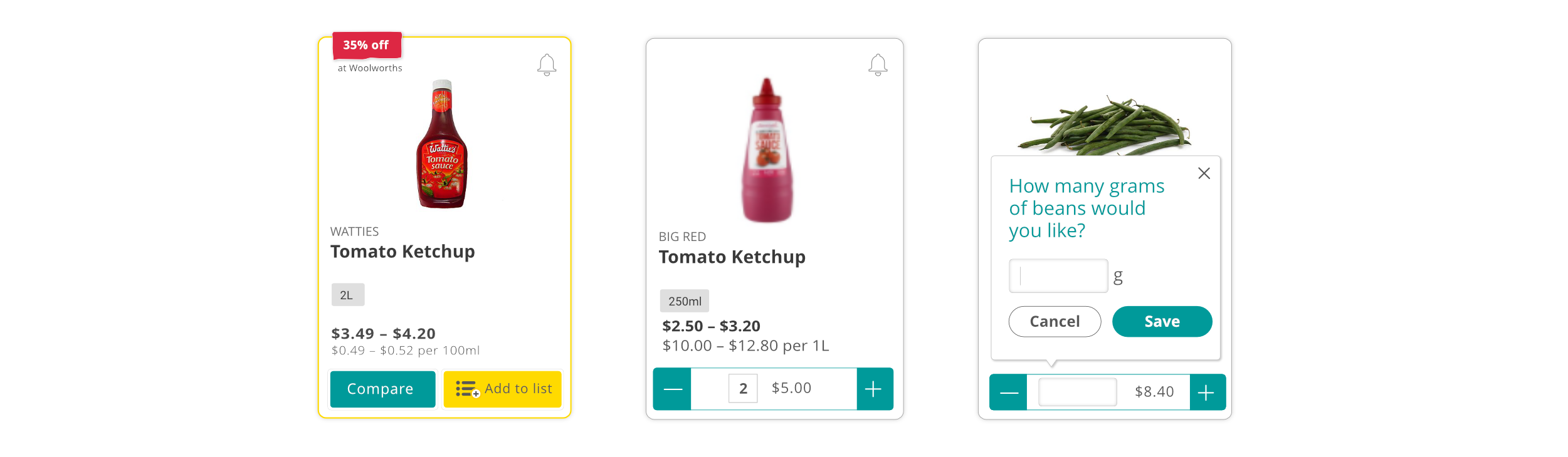
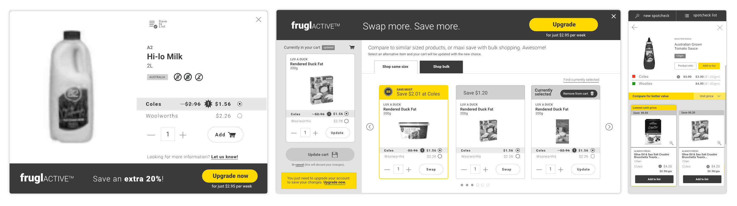
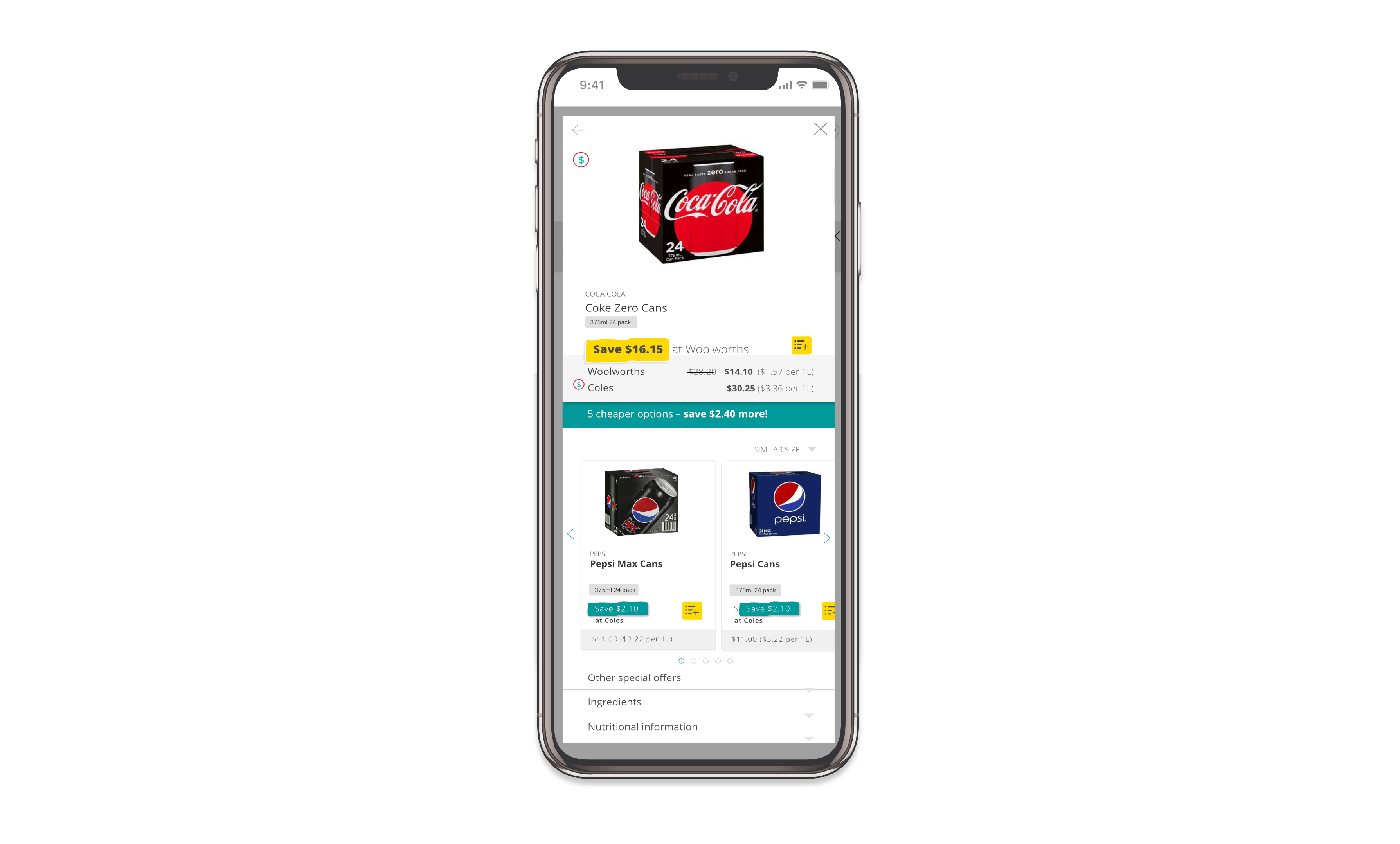
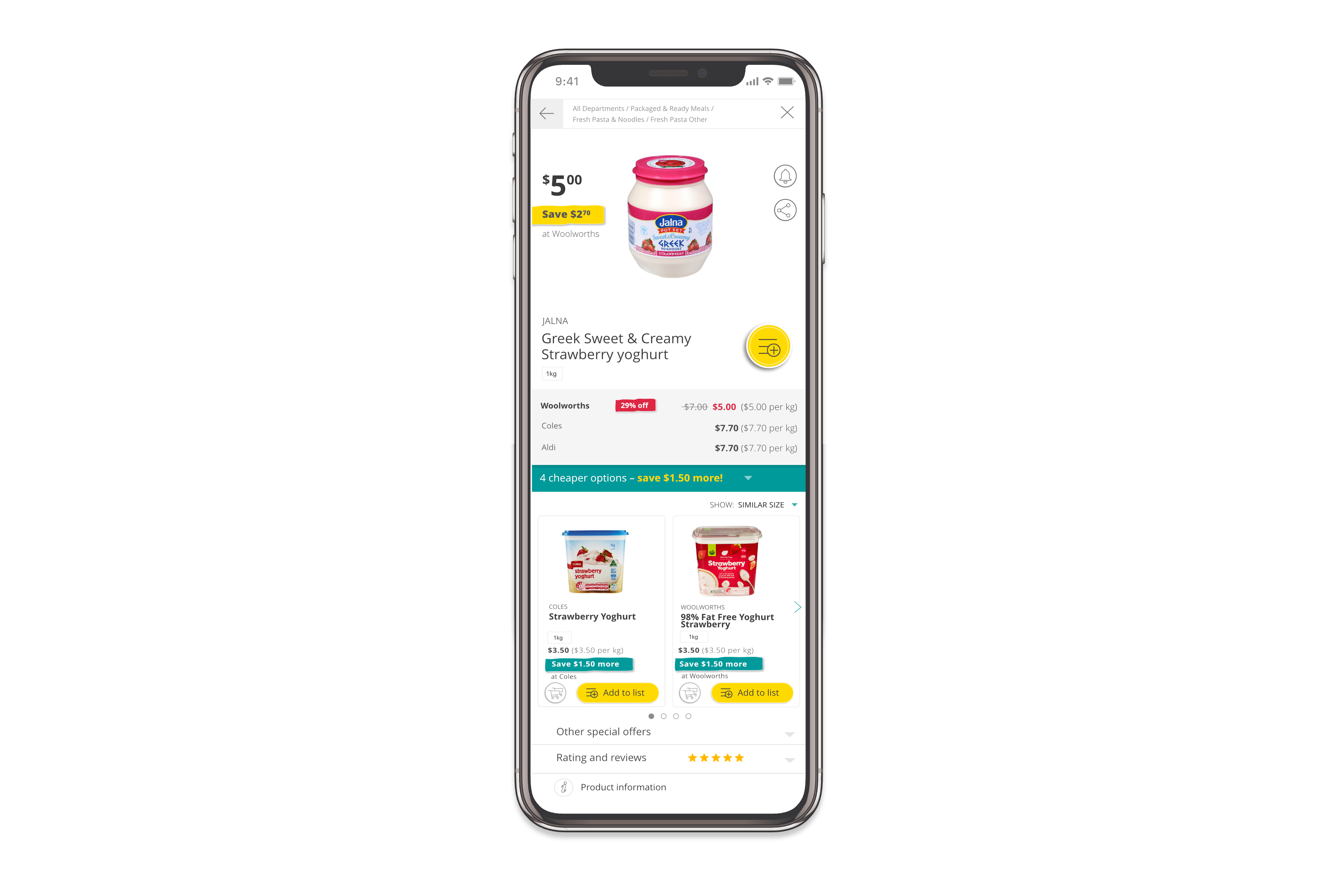
The most value for users is to be found in the product modal – it is there that they can see the supermarket comparisons and find cheaper options (with more great features to come!). To encourage users to access this modal, we have kept information on the search tiles minimal, to encourage users to tap for more information.
- Highlight savings to be made – either those to made between supermarkets, or the savings to be made by switching brands to a similar product
- Users can tap on the product tile to open the modal, or add / edit quantity of the item in their list
- In the modal, tapping on one of the cheaper items swaps that into the main position, and the cheaper options will reset – unless of course the user selected the cheapest item
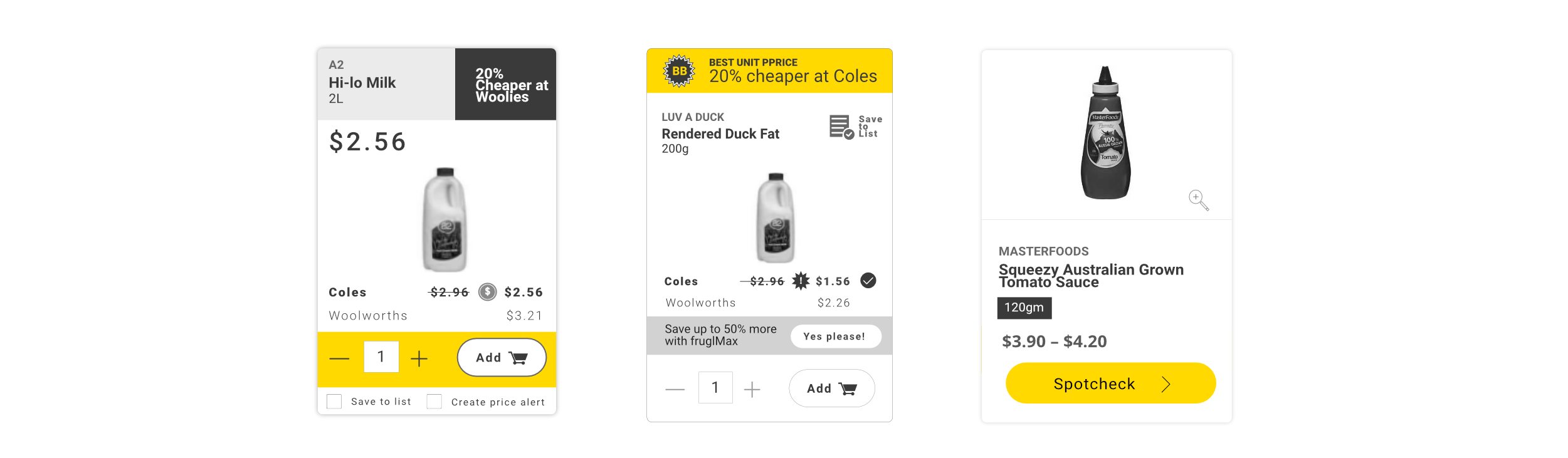
Some initial tile concepts
Tile special, tile with item added, and item added by weight
Some original modal concepts
The modal at launch
Filtering
There are 40,000 products across many categories, supermarkets can categorise items differently, and users have different expectations again. Some users prefer to find items by browsing, and others prefer key-word searches. And then, how to return high-quality results across a range of different searches?
Researching search and filtering patterns across a range of sites in different of industries was important to ensure we built something that users would recognise. With further user-testing, this will be improved of course, to ensure users can quickly and easily find what they are looking for.
- Allow for those who search by keyword, and those who search by browsing
- If a user searches for 'tomato', should we return fresh tomatoes, or tomato sauce first?
- If a user types 'blue cheese', don't return 'Ocean blue seafood products',
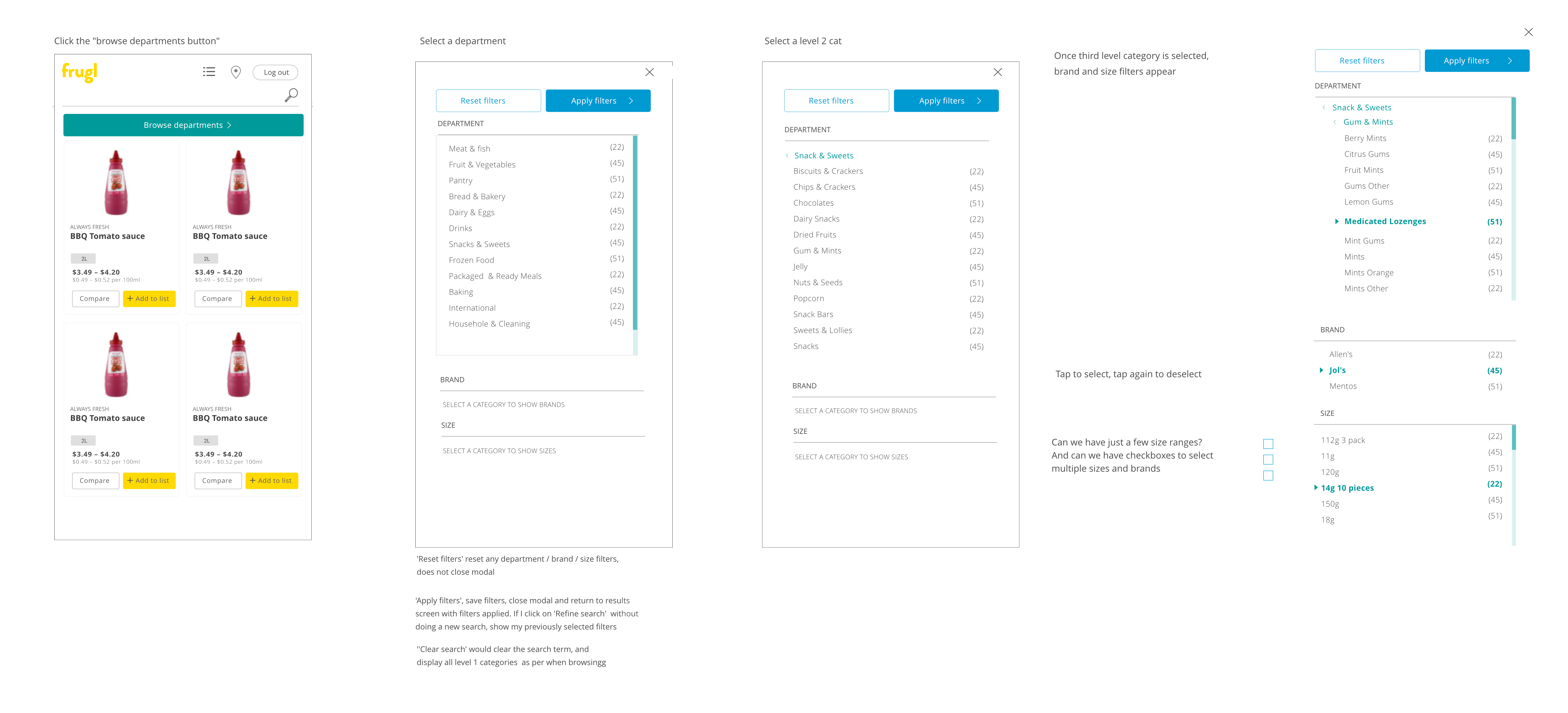
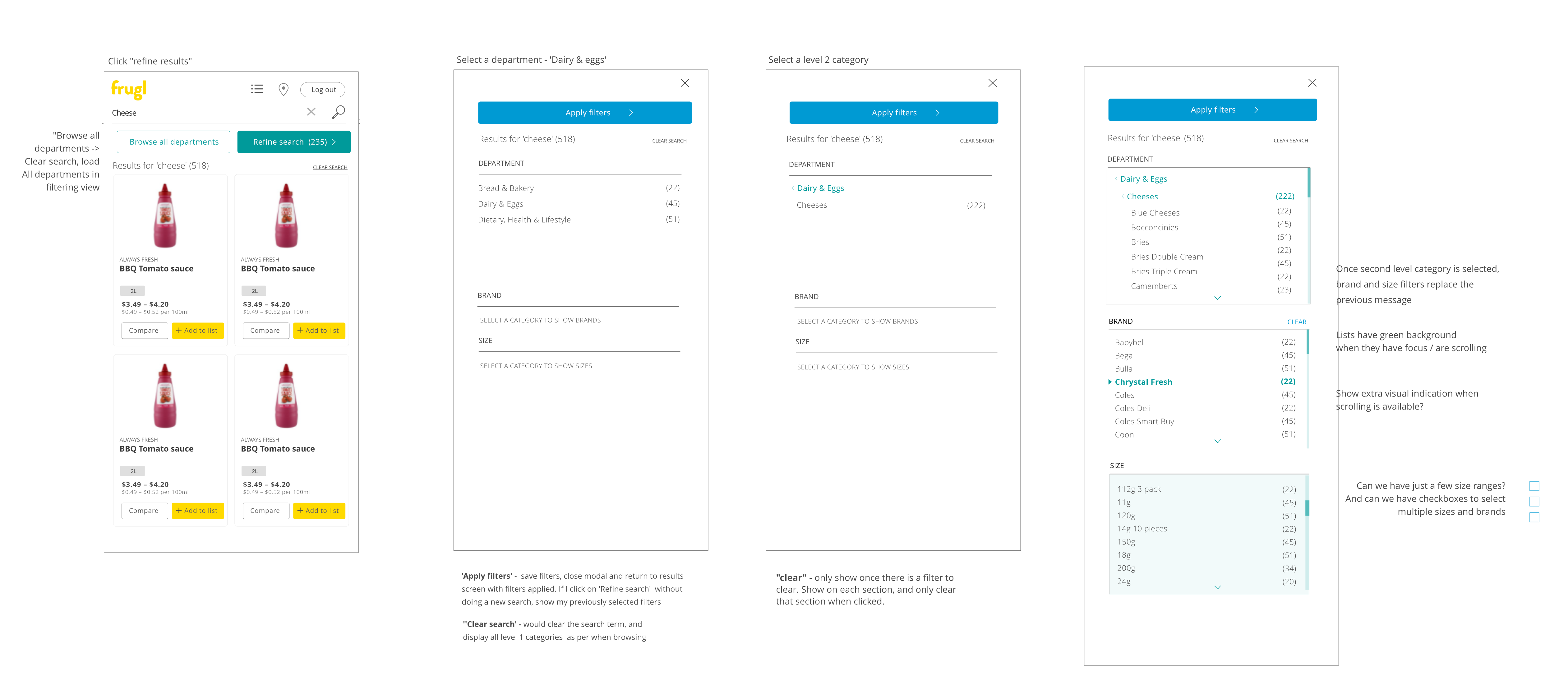
Filtering UI for when a search item has been set, so we only display those categories with items matching the search query
Homepage
Yes, there’s one of these too.
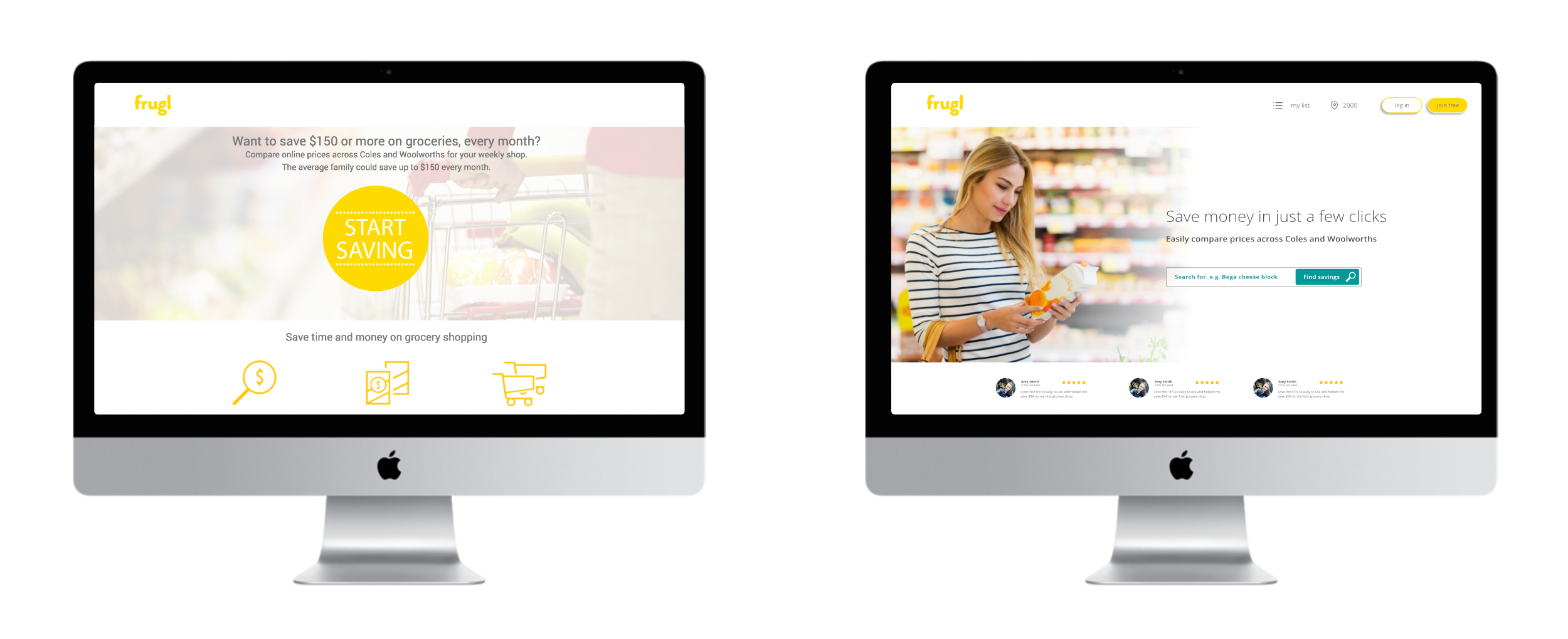
The original design (left) with the homepage design as at launch on the right
The first version was launched in July 2017, and we’ve experienced consistent sign-ups since then.
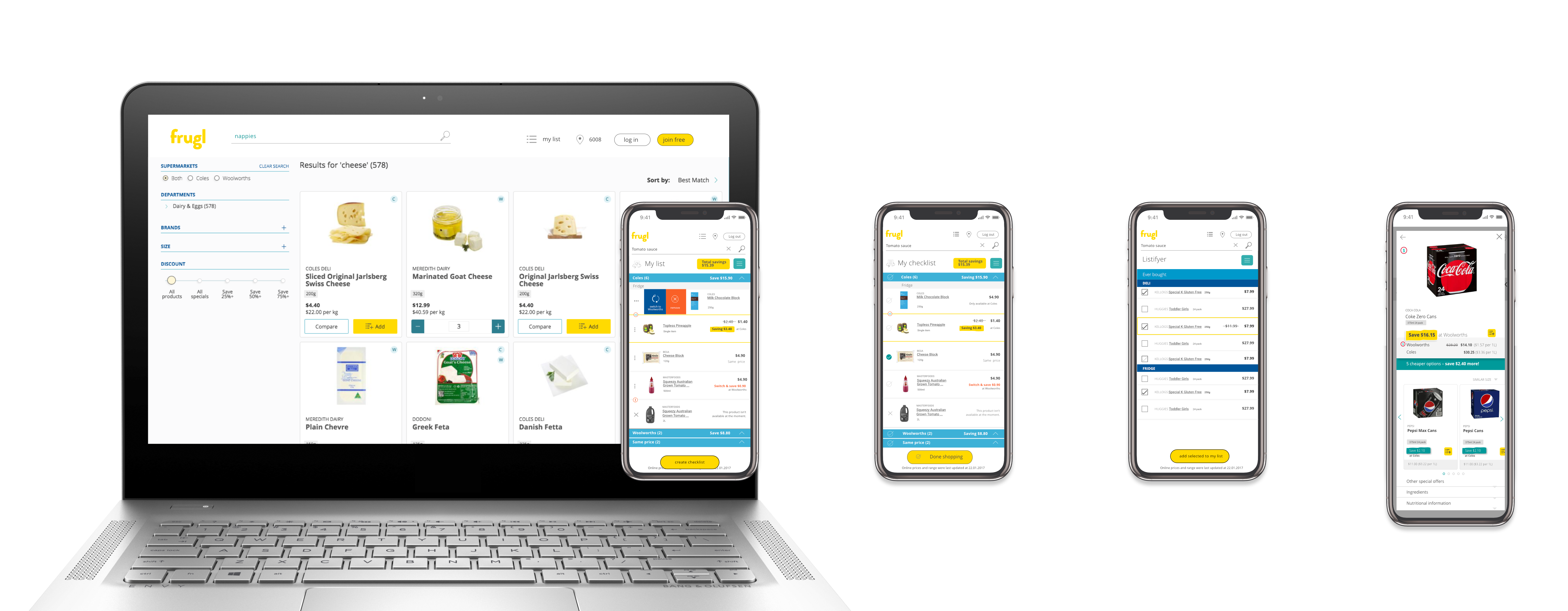
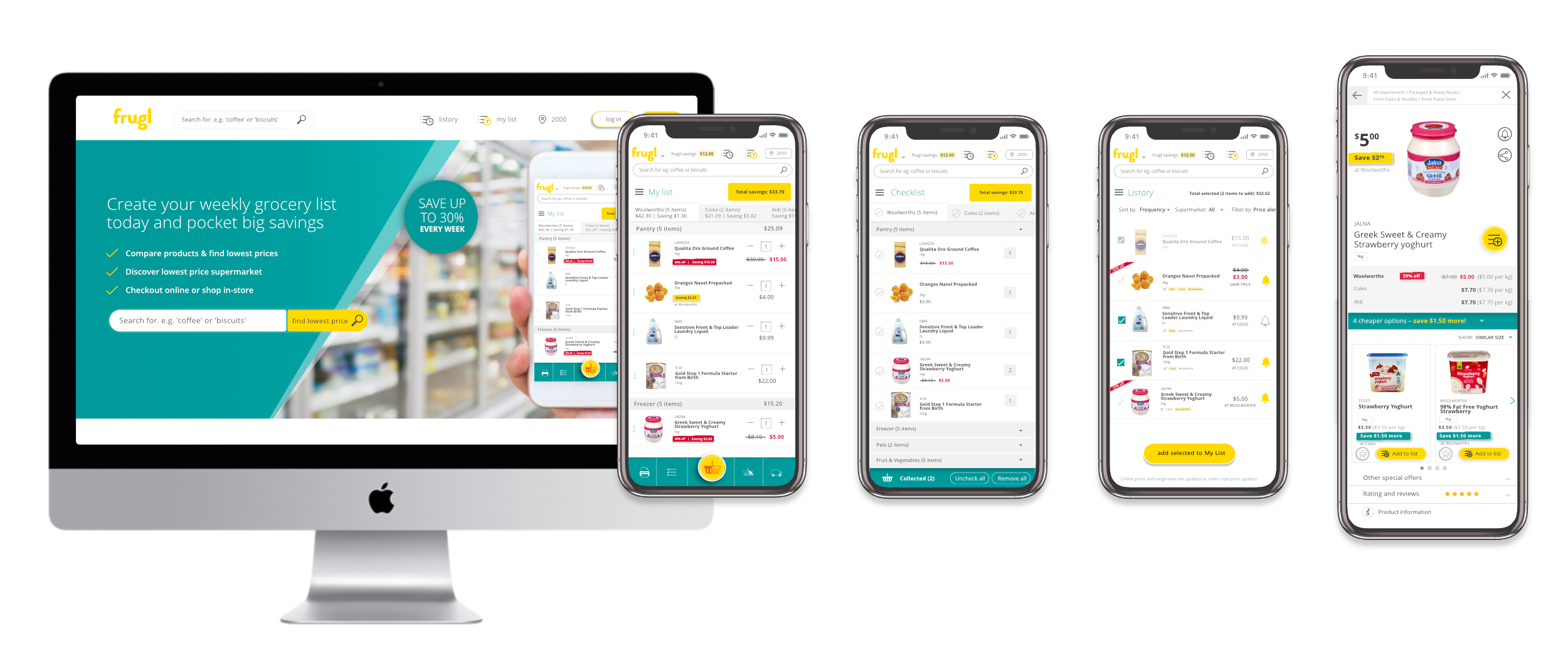
Search page, My list, Checklist, Listory and modal at launch

Such a good-looking group!
Since the first release further functional improvements – such as improved search results and better price comparisons, and additions – such as the ability to send items online, and breadcrumbs in the product modal have been made, as well as other UI & UX improvements based on customer requests, findings made observing users, and ideas and improvements generated internally.
Updated UI
New modal design
Updated UI for homepage, My list, Checklist, Listory and modal
- Change UI of lists to easier find actions
- Send online, click & collect
- Improve UI of filtering in the search screen
- Update modal to ensure price is more obvious.
- Add 'Alert' icon, where users can toggle items in and out of their price alert list
